
Adventures with Storybook, TypeScript, and Styled Components
Storybook is an amazing tool for building documentation that lives alongside a component library. It can automatically generate documentation based on PropTypes or TypeScript type definitions, UI controls for changing props and previewing those changes, code snippets, and more. Storybook offers zero-config TypeScript support and supports most JavaScript frameworks, including React, Vue, Svelte, Angular, and more.
However, supporting all of those different tools comes with a cost: introducing hundreds of edge cases that are extremely difficult and time-consuming to troubleshoot. In this post, I aim to describe some of the pain points I’ve faced when building a component library and docs site using TypeScript, Styled Components, and Storybook with CSF stories and MDX docs. I’ve spent untold hours scouring GitHub issues. This post is my attempt to round up some of the biggest head-scratchers I encountered in a central, easy-to-find place and hopefully augment Storybook’s documentation on known issues.
Table of contents
-
- The component’s variable name must match its displayName - #15401
- Styled Components + TypeScript: The main component name will show up as “Story” or “undefined” unless the component is a named export in a .tsx file - #18029
- Styled Components: If using JS and PropTypes, ArgsTable won’t pull props - #11933
- Styled Components + TypeScript 🔥 Tip: Add a propFilter to exclude third-party props
- ArgsTable won’t pull props for HOCs - #9023
Statically analyzable 🤔
The first important concept you should be aware of when using Storybook is that a lot of the underlying tooling relies on your source code and configuration files being “statically analyzable.” This means that these tools simply read the code, but do not evaluate it. For instance, let’s say you are attempting to extend a TS config file:
{
  "extends": "../path/to/tsconfig.json",
  "files": ["src"]
}
Storybook will not be able to evaluate, or even load, the TS config you are extending. You must explicitly configure TypeScript in your Storybook project.
Automatic story source only works with inline named exports for CSF stories
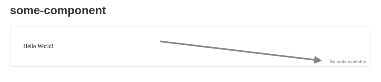
Another example where the static concept applies is automatic story source. Have you ever hit the dreaded “No code available,” even though your story preview renders fine?
In order for Storybook to pull your story’s source code, you must use inline named exports for stories:
// do this
export const BasicUsage = () => {
  return <>Hello world!</>
}

// NOT this
const BasicUsage = () => {
  return <>Hello world!</>
}
export { BasicUsage }
The second example will result in “No code available” instead of the “Show code” button. So, if you are someone who likes to keep all of your exports at the bottom of the file, tough luck. I couldn’t find anything on GitHub for this specific issue, but this concept also applies to the CSF default export. There is a GitHub issue that describes how naming a variable before exporting it as a default also results in “No code available.”
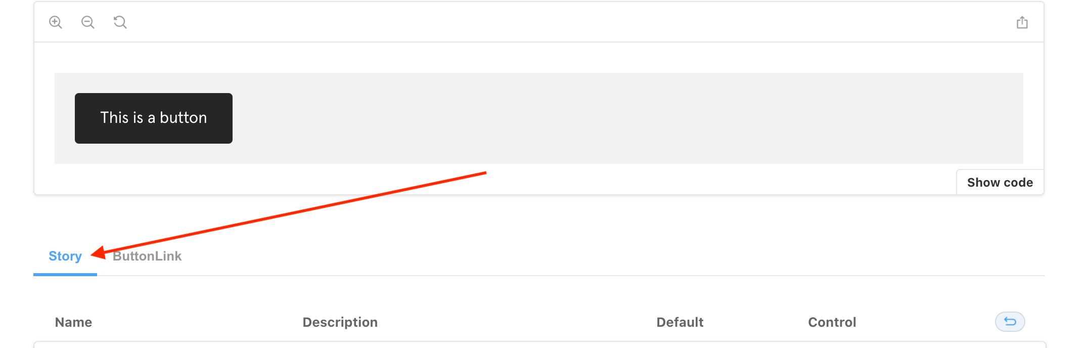
Limitations with ArgsTable
Now, I will talk about some issues I’ve encountered when using ArgsTable with TypeScript, Styled Components, and Storybook with CSF and MDX.
ArgsTable issues can be challenging to troubleshoot because the
react-docgenandreact-docgen-typescriptoutput can be cached between builds. To empty the cache, try the following:
- Start Storybook with
--no-manager-cache.- If that doesn’t work, try deleting
node_modules/.cache/storybookin your project.
The component’s variable name must match its displayName - #15401
GitHub issue: https://github.com/storybookjs/storybook/issues/15401
This applies if you are using react-docgen-typescript to generate the ArgsTable (the default config if you are using TypeScript.) If the name of the variable assigned to the component does not match its displayName exactly, props won’t be pulled into the ArgsTable. Instead, you’ll get “No inputs found for this component.”
// THIS DOESN'T WORK
export const MyComponent = (props) => {
  return <div {...props} />
}
MyComponent.displayName = 'FancyComponent' // doesn't match `MyComponent`

// THIS WORKS - displayName is inferred
export const MyComponent = (props) => {
  return <div {...props} />
}

// THIS WORKS TOO
export const MyComponent = (props) => {
  return <div {...props} />
}
MyComponent.displayName = 'MyComponent' // displayName matches
Styled Components + TypeScript: The main component name will show up as “Story” or “undefined” unless the component is a named export in a .tsx file - #18029
GitHub issue: https://github.com/storybookjs/storybook/issues/18029
The actual solution is here: #11933 (comment)
This applies if your component has subcomponents, so your ArgsTable renders a tab UI.
As the heading suggests, make sure your component has a named export. The other key is to make sure your file has a .tsx extension even if there is no JSX in it, as is common with Styled Components.
// MyComponent.tsx
import styled from 'styled-components'

export const MyComponent = styled.div``
It’s also a good idea to adhere to the aforementioned export constraints and displayName constraints. See Table of Contents.
Styled Components: If using JS and PropTypes, ArgsTable won’t pull props - #11933
GitHub issue: #11933 (comment)
If you’re like me, you have both TS and JS in your codebase and you’re incrementally rewriting in TS. So, you might have some Styled Components that are written in JS. As far as I know, there is no way to automatically pull PropTypes for a Styled Component into ArgsTable. So, at this point, your options are:
- Rewrite your component in TS (again, make sure you adhere to all of the previously mentioned constraints)
- Export the “pure” or “unwrapped” component separately, as demonstrated here: #11933 (comment)
Styled Components + TypeScript 🔥 Tip: Add a propFilter to exclude third-party props
Riffing on @alexbchr’s solution mentioned above, here is a complete example of modifying Storybook’s TypeScript config to exclude unwanted props from ArgsTable once you’ve fixed all the other issues. 😅
// .storybook/main.js
const excludedProps = ['as', 'forwardedAs', 'theme', 'ref']

module.exports = {
  // ...
  typescript: {
    reactDocgenTypescriptOptions: {
      propFilter: (prop) =>
        (prop.parent ? !/node_modules/.test(prop.parent.fileName) : true) && excludedProps.indexOf(prop.name) < 0,
      shouldExtractLiteralValuesFromEnum: true,
      shouldRemoveUndefinedFromOptional: true
    }
  }
}
ArgsTable won’t pull props for HOCs - #9023
GitHub issue: https://github.com/storybookjs/storybook/issues/9023
This is similar to the issue above, and the workaround is similar as well. If your HOC adds props, good luck!
Templates
Here are a few generic templates that take all of the above into consideration, and should work for you if you want to use Storybook with CSF stories, MDX docs, and TypeScript (with or without Styled Components.) Simply replace MyComponent with your component name, and you’re off to the races.
Bonus points: Once you’ve tweaked these templates to your liking, implement a scaffolding tool so you don’t have to keep doing the find & replace yourself. My personal favorite at the moment is plop.
MyComponent
├── index.ts
├── MyComponent.stories.mdx
├── MyComponent.stories.tsx
└── MyComponent.tsx
MyComponent.stories.tsx
Stories with type checking.
// MyComponent.stories.tsx
import React from 'react'
import { ComponentStory } from '@storybook/react'
import { MyComponent } from './MyComponent'

export const MyComponentStory: ComponentStory<typeof MyComponent> = (args) => {
  return <MyComponent {...args} />
}

MyComponentStory.args = {
  children: 'MyComponent example'
}

MyComponentStory.storyName = 'MyComponent'
MyComponent.stories.mdx
The actual docs page with embedded stories.
<!-- MyComponent.stories.mdx -->

import { ArgsTable, Canvas, Meta, Story, PRIMARY_STORY } from '@storybook/addon-docs'
import { MyComponentStory } from './MyComponent.stories.tsx'
import { MyComponent } from './MyComponent'

<Meta component={MyComponent} title="MyComponent" />

<Canvas withSource="open">
  <Story story={MyComponentStory} />
</Canvas>

<!-- `story={PRIMARY_STORY}` is key here for working ArgsTable controls -->

<ArgsTable of={MyComponent} story={PRIMARY_STORY} />
MyComponent.tsx
The component source code.
// MyComponent.tsx
import React from 'react'

export interface MyComponentProps {
  children?: React.ReactNode
}

export const MyComponent = ({ children }: MyComponentProps) => {
  return <>{children}</>
}

MyComponent.displayName = 'MyComponent'

export default MyComponent
index.ts
// index.ts
export * from './MyComponent'
Storybook config
Finally, here is a base Storybook config that should work well with these templates:
// .storybook/main.js
module.exports = {
  framework: '@storybook/react',
  stories: ['../src/**/*.stories.mdx', '../src/**/*.stories.@(js|jsx|ts|tsx)'],
  addons: ['@storybook/addon-essentials']
}
Conclusion
In summary:
- It’s a good idea to write your stories in CSF, that way you get proper linting and IntelliSense. If you need extra documentation to go along with your stories, try the CSF stories + MDX docs recipe.
- Always use inline, named exports for your components and stories.
- Make sure your components’
displayNames match their file/variable names exactly. This is good practice anyway, and in most cases, you don’t even have to specify adisplayName. - If you aren’t already, now is a great time to start writing your components in TypeScript.
- Make sure files for TS Styled Components end in
.tsxrather than.tseven if there is no JSX. - Exclude
as,forwardedAs,theme, andreffrom all ArgsTables using a globalpropFilter, but be aware that you will need to re-provide some default Storybook TypeScript config such asshouldExtractLiteralValuesFromEnumandshouldRemoveUndefinedFromOptional. - Refer to documented workarounds for HOCs.
Hopefully this serves as a guide for you to create your own Storybook docs templates, or at least a helpful bookmark!
GitHub Discussion
If you’ve read this, tried everything, and are still scratching your head, I’ve opened a GitHub discussion here. ✌️
Version info
These are the specific versions of the tools I was using at the time of this post:
- Storybook v6.4
- Essential addons
- MDX 1
builder: 'webpack5'babelModeV7: true
- React v17
- Node v16.16
- TypeScript v4.7
- Styled Components v5.3
Back to home page